CSSアニメーションの説明
CSSアニメーションの注意事項
“点滅を伴うアニメーションは、注意欠陥障害 (ADHD) のような認知障害を持つ人々に問題を起こす可能性があります。加えて、特定の種類の動きが、前庭障害、てんかん、片頭痛、痙攣感受性などの引き金になることもあります。”
アクセシビリティの考慮 mdn
このページはいくつかアニメーションする表現があります。苦手な方はご注意ください。
目次
CSSアニメーションとは?
CSSだけでアニメーションが可能です。
例 ➡
CSSのスタイルを時間経過とともに変化させてアニメーションを実現します。
CSSアニメーションの作成方法
「アニメーションのプロパティ」と「キーフレーム」を作成します。
- アニメーションのプロパティ : 時間、変化速度など
- キーフレーム : 時間ごとのCSSスタイル
アニメーションのプロパティ
アニメーション用のCSSプロパティを確認しましょう。
- animation-name: 使用するキーフレームの名前の指定
- animation-duration: 1サイクルの時間
- animation-timing-function: 動きの緩急
- animation-delay: 開始遅延時間
- animation-iteration-count: 繰り返し回数/無限
- animation-direction: リセット時の逆方向動作
- animation-fill-mode: 実行前後のスタイル。animationが終了したときのスタイル
- animation-play-state: 一時停止と再開
- animation: 一括指定プロパティ
animation-name
キーフレーム「@keyframes」で定義した名前を指定します。
animation-name: sample-animation;
animation-duration
1サイクルのアニメーション時間を設定します。
単位は、「s」「ms」があります。
animation-duration: 1000ms;animation-duration: 2s;
animation-timing-function
アニメーションの緩急を定義します。
animation-timing-function: linear;
よく使うイージングのキーワードと関数
- ease : 増加➡増加➡ゆっくり【規定値】
- ease-in : 遅い➡遅い➡早い
- ease-out : 早い➡早い➡遅い
- ease-in-out : 遅い➡早い➡遅い
- linear : 等速
- step-start : 最初のstepでアニメーションを完了する
- step-end : 最後のstepでアニメーションを完了する
- cubic-bezier(0.0, 0.0, 1.0, 1.0) : 自由にベジェ曲線
- linear(0, 0.25 25% 50%, 1) : 自由自在
- steps(4, end) : 離散的に表示。endで完了する
timing-function 参考
animation-delay
アニメーション始める前の待機時間を指定します。
マイナス値を指定するとアニメーションが進んだ状態から開始されます。
animation-delay: 3s;animation-delay: -200ms;
animation-iteration-count
アニメーションする回数を指定します。
実数も指定できます。
infiniteを指定すると無限回数です。
animation-direction:alternate; を指定した場合、戻りの逆方向再生は1回のカウントです。
animation-iteration-count: infinite;animation-iteration-count: 3;animation-iteration-count: 1.5;
animation-direction
アニメーション終了時に逆再生するか初期状態から再生するか指定できます。
animation-direction: normal; // 【初期】アニメーションが終了すると最初から繰り返すanimation-direction: alternate; // アニメーションが終了すると逆再生するanimation-direction: reverse; // 反対方向に再生animation-direction: alternate-reverse; // 反対方向にalternate再生
animation-fill-mode
アニメーションの開始と終了時のキーフレームで指定されたCSSスタイルを維持します。
animation-fill-mode: none; // アニメーション前後でスタイルを維持しません。animation-fill-mode: forwards; // アニメーション終了時のスタイルを維持します。animation-fill-mode: backforwards; // アニメーション開始時のスタイルが反映されます。Delay中も反映されます。animation-fill-mode: both;アニメーション前後でスタイルを維持します。
初期色 : 群所色、キーフレーム0%色 : 紫、キーフレーム100% : 赤
animation
一括指定プロパティです。
name, timing-function, delay, duration, direction, fill-mode, interation-count, play-state, の一括指定です。
数値の指定が2つある場合、最初の数値はdurationです。次の値は、delayです。
animation: 3s ease-in 1s 2 reverse both paused slidein;animation: 3s linear 1s infinite alternate slidein;
キーフレームの設定
@keyframes では、キーフレームごと(経過時間)のCSSスタイルを定義します。
始点、いくつかの中間点、終点のCSSスタイルを定義可能です。
0% は、from、100%は、toと記述しても同じです。
@keyframes sample-animation {
    0% {
        color: white;
    }
    50% {
        color: yello;
    }
    100% {
        color: black;
    }
}
Sample
いくつかのsampleです
横移動のサンプル
marginを変化させて横移動しているように見せています。
移動する要素幅が20%です。margin-leftの初期位置が-20%です。ちょうど隠れますね。
<div class="div1">
    <div class="sample-animation">Hello!</div>
</div>
.div1 {
background-color: burlywood;
width: 80%;
overflow-x: hidden;
}
.sample-animation {
background-color: cornflowerblue;
width: 20%;
animation-name: sample-animation;
animation-duration: 6s;
animation-iteration-count: infinite;
animation-timing-function: linear;
}
@keyframes sample-animation {
0% {
margin-left: -20%;
}
100% {
margin-left: 100%;
}
}sample-animation
色変化のサンプル
色変化のアニメーションです。
文字色、ボーダー色を変化させています。
<p class="ani3">Animation.</p>.ani3 {
animation-name: ani3;
animation-duration: 2s;
animation-iteration-count: infinite;
animation-direction: alternate;
animation-timing-function: ease-in;
font-size: 2rem;
font-weight: bold;
padding: 2px 9px;
border-radius: 10px;
border: 5px solid lightblue;
color: lightblue;
}
@keyframes ani3 {
from {
color: lightblue;
border-color: lightblue;
}
to {
color: blue;
border-color: blue;
}
}sample-animation
Animation.
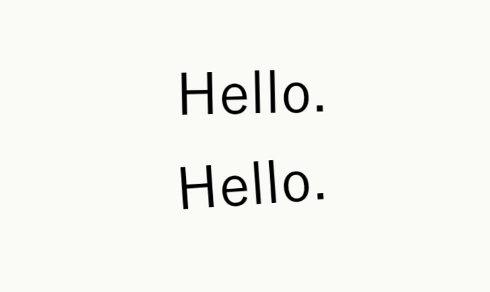
傾き、揺れのサンプル
揺れの表現
インライン要素にはtransformなどは効きませんね。inline-blockに変更しておきましょう。
カクカク動作させるのは、50%、51%の中間点をいれるのがコツですね。
<div>
    <span class="d2 anima">Hello!</span>
    <span class="d2 anima1">Hello!</span>
</div>
.d2 {
display: inline-block;
margin: 0 8px;
font-size: 2rem;
}
.anima {
transform: rotate(-4deg);
animation-name: anima2;
animation-direction: alternate;
animation-duration: 1.4s;
animation-iteration-count: infinite;
animation-timing-function: linear;
}
.anima1 {
transform: rotate(-4deg);
animation-name: anima1;
animation-direction: alternate;
animation-duration: 1.4s;
animation-iteration-count: infinite;
animation-timing-function: linear;
}
@keyframes anima1 {
0% {
transform: rotate(-4deg);
}
50% {
transform: rotate(-4deg);
}
51% {
transform: rotate(4deg);
}
100% {
transform: rotate(4deg);
}
}
@keyframes anima2 {
0% {
transform: rotate(-4deg);
}
100% {
transform: rotate(4deg);
}
}sample-animation
回転のサンプル
<p class="p4 kaiten">★</p>.kaiten {
margin-left: 8px;
animation-name: kaiten;
animation-duration: 10s;
animation-timing-function: linear;
animation-iteration-count: infinite;
}
@keyframes kaiten {
from {
transform: rotate(0deg);
}
to {
transform: rotate(360deg);
}
}sample-animation
★
Animation events
JavaScriptで拾えるEventあり
このsampleのアニメーションは、p要素が、3s待機後に右に200px移動するanimationを3回行う。
アニメーション中にresetボタンを押すと、「canceled」が発生します。
Animation Event
発生しうるイベントは4つありました。
5.2. Types of AnimationEvent =W3C Working Draft= Link
- animationstart
- animationend
- animationiteration
- animationcancel
イベントプロパティ
- animationName : 使用しているキーフレームの名前
- elapsedTime : 経過時間。Delayは含まれない
- pseudoElement : 擬似要素の名前
要素を回転すると画面をはみ出してしまう現象
要素を移動したり回転すると、横スクロールバーが出現することがありました。
親要素のbodyにoverflow-x: hidden; を指定していても、chromeだと横スクロールバーがチラチラと表示されてしまいました。
横幅100%サイズの要素を回転させると、はみ出してしまうようですね。
対策
- 適当なdiv要素を親要素としてoverflow-x: hiddenを設定すると、横スクロールバーは表示されなくなりました。
- 若しくは、回転させる要素を、はみ出さない程度に横幅を縮めてください。
どの要素がはみ出しているか目視したい
全要素にoutlineを引いて要素のサイズを確認してみましょう。
以下のJavaScriptのコードをブラウザのコンソールに張り付けると全要素にoutlineが引かれます。
document.querySelectorAll('*').forEach(element => {
    element.style.outline = '1px solid tomato'
});
もちろんCSSでoutlineを引いても同じです
* {
    outline: 1px solid red;
}
CSSアニメーションのリセット再実行する方法
これを実現するちょうどよいメソッドは無いようです。皆さんBlogを拝見すると色々工夫しているようです。参考までに以下方法論。
1. CSSを外して取り付ける。しかし、早すぎるとダメなようで少しのwaitが必要です。
2. クリックで外して、クリックで付ける。人間の動作なので付けるまでのwaitは十分ですね。
3. アニメーションのendイベントでCSSを外す。→ restartボタンなどで取り付ける。
4. requestAnimationFrame内でCSSクラスを取り付ける。入れ子にして2回callする必要があるようです。
resetボタンのsample
document.querySelectorAll("button.reset").forEach(function (ele) {
    ele.addEventListener("click", (event) => {

        // resetボタンの親基点に兄弟divを検索する
        // ボタンの兄弟div要素がアニメーションする体
        const parent = event.target.parentElement;
        const children = parent.querySelectorAll("div");

        // アニメーションのcssクラスは"ani-"から始まる体
        children.forEach((child) => {
            var classname;
            if (child.className.includes("ani")) {
                classname = child.className;
                child.className = "";
                window.requestAnimationFrame(function () {
                    window.requestAnimationFrame(function () {
                        child.className = classname;
                    });
                });
            }
        });
    });
});
参考文献 参考資料
CSS アニメーションのヒントとコツ アニメーション再実行のコツが記載されています
CSS animation 一括指定のプロパティです
CSS transform 回転や移動するときに使います
How to draw any regular shape with just one JavaScript function | JavaScriptだけで規則的な形状を描画する方法